
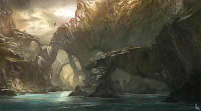
Well let me explain, I had to pick as image from my visual mood board (still under construction) and use it as a template for my kind of retarded drawing skills. The image above is the image I picked and the one below is my finished sketch.
In detail - My finished drawing is different from the original as I didn't want to just copy it, I wanted to make it my own and so I decided to change it slightly, my first change was the water, I substituted water for sand and I only copied the first few rock formations and in the background I drew a little village and also Incorporated trees. I used two different types of pencils 2H which was used to draw the entire thing and for shading and outlining I used a darker 4B pencil. The shading was to allow my drawing too look more 3D, I did this by determining a light source and shading the darker areas. The 4B pencil was softer and therefore allowed my to extract darker tones. Compared to the original I believe it is similar but because the original was made using computer software it looks more realistic as the shading is clearly defined. This exercise was to improve our drawing skills and relearn all the lost information from high school art classes such as shading.
In detail - The reason for choosing this image was because I like concept images and I am inspiring to create my own 3D fantasy environment so I hope to create something similar in the future and another reason for changing aspects like the water is because I prefer to do this when the time comes to create my own. We were then instructed to split the finished drawing off into four sections to practise different types of colouring (See Above) Top Left - Felt Tip Pens, Top Right - Pastels, Bottom Left - Colour Pencil and Bottom Right was left blank.
Since I knew I was going to spoil my drawing anyways I decided to go crazy with colouring and planted what I had on paper hence the blue rock formation and yellow path. But I refuse to take all the blame as the felt tips and coloured pencils were of pound shop quality. Although I fell for the pastels they make anything look cool.
In detail - By using my drawing as a test I am able to see what medium I excel at, so that when the time comes I will use it to create my own concept art.
 This image is the final product of my wacky colouring skills, and I am proud of what came,,, but I have to thank our teacher Mel-Sensei as she was able to salvage my image with a selection of fine detail and extra pastel smudging.
In detail - Pastels are good at defining 3D objects as you can smudge them to create shadows but you also have the option of easily incorporating more than one colour to give the image a more realistic look. The detail was done using a black fine liner as I needed to clearly show what objects were, for example the previously plain yellow path looks like a brick road because of the detail added.
In detail - My finished drawing is different from the original as I didn't want to just copy it, I wanted to make it my own and so I decided to change it slightly, my first change was the water, I substituted water for sand and I only copied the first few rock formations and in the background I drew a little village and also Incorporated trees. I used two different types of pencils 2H which was used to draw the entire thing and for shading and outlining I used a darker 4B pencil. The shading was to allow my drawing too look more 3D, I did this by determining a light source and shading the darker areas. The 4B pencil was softer and therefore allowed my to extract darker tones. Compared to the original I believe it is similar but because the original was made using computer software it looks more realistic as the shading is clearly defined.
 This exercise was to improve our drawing skills and relearn all the lost information from high school art classes such as shading.
In detail - The reason for choosing this image was because I like concept images and I am inspiring to create my own 3D fantasy environment so I hope to create something similar in the future and another reason for changing aspects like the water is because I prefer to do this when the time comes to create my own.
 We were then instructed to split the finished drawing off into four sections to practise different types of colouring (See Above) Top Left - Felt Tip Pens, Top Right - Pastels, Bottom Left - Colour Pencil and Bottom Right was left blank.
Since I knew I was going to spoil my drawing anyways I decided to go crazy with colouring and planted what I had on paper hence the blue rock formation and yellow path. But I refuse to take all the blame as the felt tips and coloured pencils were of pound shop quality. Although I fell for the pastels they make anything look cool.
In detail - By using my drawing as a test I am able to see what medium I excel at, so that when the time comes I will use it to create my own concept art.
 This image is the final product of my wacky colouring skills, and I am proud of what came,,, but I have to thank our teacher Mel-Sensei as she was able to salvage my image with a selection of fine detail and extra pastel smudging.
In detail - Pastels are good at defining 3D objects as you can smudge them to create shadows but you also have the option of easily incorporating more than one colour to give the image a more realistic look. The detail was done using a black fine liner as I needed to clearly show what objects were, for example the previously plain yellow path looks like a brick road because of the detail added.


No comments:
Post a Comment