Tuesday, 30 November 2010

Intellectual Arcade - Game Plan


Synopsis
In the future 2278AD, time is no longer linear, Time travel is here, and it opens the door for a new type of threat,...
....The Nazi Time Police
After the sudden return of Germany's former General Dieter Grimmer in 2246AD, he and the NSDAP lieutenants declare war against the World Union its self and he brings forth new technologies which over whelm and incapacitate the Allied States. The Generals following becomes larger and he appoints himself the World Führer and the NSDAP became the NSZP (Nationalsozialist Zeitpolizei). Lieutenant Heinrich Runge of the NSZP betrays the General and steals the technology from Project TRAIN, he is shot 6 times while struggling he uses the technology and travels to 19th century America.Back Story

2224AD Germany states it is in civil war after its head of state Yohann Liebert was assassinated by the NSDAP (Nationalsozialistische Deutsche Arbeiterpartei) and because of recent affairs Germany's leading general Dieter Grimmer is brought to power and in the process Germany becomes a military controlled state.
2225AD The war continues and it is brought to the attention of the World Union that the assassination of the former head of state Yohann Liebert was staged to allow the leading General Dieter Grimmer to rise to power. And even more disturbing is that the civil war is only a pretext to kill all those who are deemed insuperior by the NSDAP.
2232AD Germany becomes a Communist state and German inhabitants are rushing to the Czech Republic boarder to escape the German Military and NSDAP. The World Union and the Allied States are unable to do anything as under the rules of state Independence, civil war is the responsibility of the country, and unless help is asked for by the head of state foreign forces are forced to do nothing.
2239AD The Czech Republic and Slovakia surrender to the Germans under threat of nuclear war and both states are occupied by Germany, but this gives the World Union and the Allied States the right to invade Germany, and by the World Union, World War IV is declared against Germany.
2240AD Even with Germany's advanced nuclear programme the Allied States are able to over come the German Military and NSDAP with few casualties, Germany is then occupied by the Allied States, but the former General Dieter Grimmer is nowhere to be found, a large investigation was started and the former General Dieter Grimmer became an international wanted person by the World Union and where the punishment for his crime would be execution.
2245AD After investigation by the World Union a report shows a secret military operation started by the former American Empire by Chinese Scientist Yao Ming using Chinese research in Quantum Teleportation from before the American Colonisation of Mainland China in World War III which was continued by Germany after the allied states victory over the American Empire in 2128AD the project was continued again in 2219AD and was personally looked after by the former General himself unfortunately all documents of the project where destroyed and workers of the project where either missing or dead, the name of the secret operation was Project TRAIN..

Hehe I know went a little crazy, but I enjoyed it. I doubt my team will take a liking to it though.

Individual Team Plans
Luke;
Environment - 19th century western America, Environment Plans - A big desert canyon
Characters - Naive Americans, Cowboys
Objects - Totem poles that are used as teleportation Gateways, Train the link between worlds and time.
Marcus;
Environment - 5000BC Ancient Egypt - A big desert with pyramids and with a Mexican theme
Characters - Stone Sphinx Statues that come to life
Objects - Sarcophagus used for power ups
Jordan;
Environment - Fantasy Environment - A large castle
Characters - Blue Indians (Based on The Avatar)
Costume - old Civil American (Based on Dances with Wolves)
Steven;
Environment - Futuristic Metropolis - A urbanised city (Based on Tokyo Sky City and Mirror Image), also an underground sewer like the Sawyers of Paris with Creaian Greek Deco
Characters - Time cops with leather over coats (could be Nazis?) Based on Torchwood's Captain Jack
Objects - Flying cars (Based on the Fifth Element)

Me;
I first planned on having only human realistic characters, but from exploring different types of game and fantasy art I have decided if I have time I would create characters like Abe, I don’t like the idea of realism in games as for my characters should look weird as that is the appeal. Only the main character will look human the NPCs including enemies
will look unreal to bring forth a fantasy theme.

To further give my environment a fantasy theme I will add different art styles for buildings, interior and scenery. The idea for my environment came from Final Fantasy as each new game has its own world, cities and characters, so there is a lot to choose from, I like the sheer scale of the environments and have decided that mine will also be big as I wish to put a lot of scenery and other doodahs, I have decided that I will have a rope bride and also rock formations, trees and a small village. I will create my own sculptures for my environment, the Final Fantasy Franchise serves as inspiration, I wish to include some supplementary objects or others similar for visual eye candy, they wont serve any narrative purpose but can provide cover from enemy attacks. The sculpture will have meaning within the game for example the objects might represent the culture meaning.

The buildings I will create will be inspired by Roman architecture, The buildings will be in ruins and provide a battle ground for my game, the interior of the buildings will be from the same period but as they are ruins it will be made to look destroyed. The small city will be completely based on gothic style building as I want to make the city look dark, and gothic is the way to go in that aspect. The will be another scene in this city but I haven’t yet decided what it will be. This will be the area where you can interact with non playable characters and buy items from.

When it comes to the interior of my roman inspired buildings which was decided that they will be ruins for the setting of a battlefield, will have an Early Christian design as it fits in nicely because Early Christian design was elaborated from Roman. The
pillars will provide nice cove when it comes to defending from enemies, the scale will be efficient for fighting inside as well as outside the buildings.


Thursday, 25 November 2010

Environmental effects

Today I have been experimenting with environment effects and so I created a simple primitive sphere and textured it and used it as a basis for my experimental creativity.


Above is the sphere without any environment affects.. First I changed the background using a bitmap from the Internet and the only difference with this shape it that there is an omni light on the corner of the sphere.

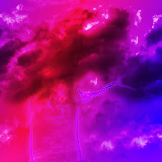
The first environment affect I tried was "fire" which I placed on a atmospheric gizmo and I changed the colours to purple rather than the iconic red.This effect is a layer fog affect which I placed as the background.The final image has a fog affect on the sphere, but I put a opacity map on it and changed the colour to give it a green glow.

Monday, 8 November 2010

Another moodboard, Environment Visual

This is another one of my mood boards created using images from the Internet that inspire me for the creation of my 3D environment.

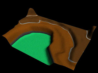
As my environment will be a rocky terrain I have got a lot of images that have rock formations and mountains, so I know what type of texture to use and to give ideas on different environment objects such as futuristic cities to small villages.

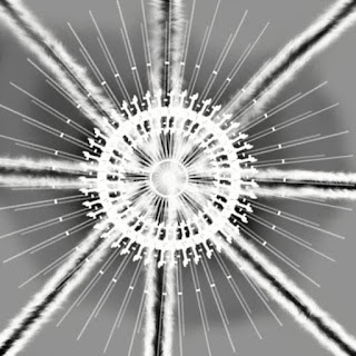
The star gate image will be used to inspire a similar construction for the transportation of a train from each of our teams environments.

The colours are mostly dark as my environment will have little light so I wanted images that would allow me to visualise a darker environment. There is also images of trees as I wish to add some vegetation, to show my skill.

Sunday, 7 November 2010

Drawing?? Its a plan (Unit 66/72)


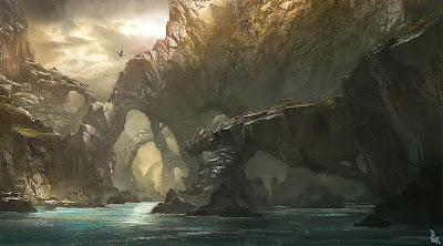
Well let me explain, I had to pick as image from my visual mood board (still under construction) and use it as a template for my kind of retarded drawing skills. The image above is the image I picked and the one below is my finished sketch.
In detail - My finished drawing is different from the original as I didn't want to just copy it, I wanted to make it my own and so I decided to change it slightly, my first change was the water, I substituted water for sand and I only copied the first few rock formations and in the background I drew a little village and also Incorporated trees. I used two different types of pencils 2H which was used to draw the entire thing and for shading and outlining I used a darker 4B pencil. The shading was to allow my drawing too look more 3D, I did this by determining a light source and shading the darker areas. The 4B pencil was softer and therefore allowed my to extract darker tones. Compared to the original I believe it is similar but because the original was made using computer software it looks more realistic as the shading is clearly defined.This exercise was to improve our drawing skills and relearn all the lost information from high school art classes such as shading.
In detail - The reason for choosing this image was because I like concept images and I am inspiring to create my own 3D fantasy environment so I hope to create something similar in the future and another reason for changing aspects like the water is because I prefer to do this when the time comes to create my own.We were then instructed to split the finished drawing off into four sections to practise different types of colouring (See Above) Top Left - Felt Tip Pens, Top Right - Pastels, Bottom Left - Colour Pencil and Bottom Right was left blank.
Since I knew I was going to spoil my drawing anyways I decided to go crazy with colouring and planted what I had on paper hence the blue rock formation and yellow path. But I refuse to take all the blame as the felt tips and coloured pencils were of pound shop quality. Although I fell for the pastels they make anything look cool.
In detail - By using my drawing as a test I am able to see what medium I excel at, so that when the time comes I will use it to create my own concept art.

This image is the final product of my wacky colouring skills, and I am proud of what came,,, but I have to thank our teacher Mel-Sensei as she was able to salvage my image with a selection of fine detail and extra pastel smudging.
In detail - Pastels are good at defining 3D objects as you can smudge them to create shadows but you also have the option of easily incorporating more than one colour to give the image a more realistic look. The detail was done using a black fine liner as I needed to clearly show what objects were, for example the previously plain yellow path looks like a brick road because of the detail added.

Making rope

Well for my environment I wanted to create a few doodas and one that came to mind was a rope bridge, but the problem was the rope, but with the help of my friend Google, I found a tutorial to help me achieve my goal.
Step 1 - I would create a cylinder and use that as a template to create more smaller cylinders around the larger one, then after encircling the larger cylinder, I would then delete that cylinder, so all that was left are the smaller cylinder shapes.
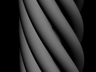
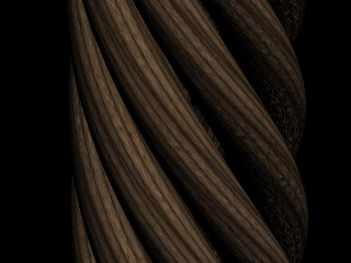
Step 2 - I attached all the shapes and put a twist modifier on them and they looked like this (Below)


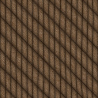
Step 3 - I went on to texture them by finding an online rope texture and to make it look a little more realistic I placed a bump texture on as well.
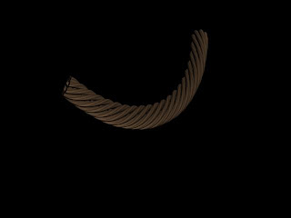
Step 4 - after finally texturing it, I realized it was too big and wide for a rope so I re sized it to fit its propose, and to finish I put a Bend modifier on the finished product. (See last image)Here is the final product I do think it is too neat for a rope bridge but that was because I used a circular cylinder instead of a edged cylinder like in the tutorial.
Just in case my ranting doesn't make sence this is the URL were the tutorial I used is. http://www.cgtextures.com/content.php?action=tutorial&name=rope

Thursday, 21 October 2010

Genre/Theme choices

The idea for what we wanted as a team where different from each other, but then I came up with a great idea, we would somehow use all our ideas and merge them into one trailer. Because Luke our modeler already had started work on a train, I was inspired by Back to the future III and the idea of using a train to jump through a variety of environments.
And borrowing the technology of Stargate, we will use something with similar design to transport our train.
The worlds we would have would include an American western, Futuristic Metropolis and a Fantasy World. the worlds would only have the train track and portal in common the rest would be completely original, because of this turn of events out game trailer will have a lot off genres the main one being a Fantasy.

I personally was inspired to do a fantasy world from the game franchise Final Fantasy. I wish to create an extremely complicated environment that is like maze as I wanted something that stands out.
The thunder plains environment from Final Fantasy X has some features I would want for my environment such as fog and the natural lighting rods. I will build these myself in max although I am worried how much time it will take to render if I choose to put in lighting as well as fog.


Thursday, 14 October 2010

Brain Storm for Team Name

Well I should have posted this first as it is the brainstorm for our team name. Our first lesson was to decide a name and we came up with a list and voted for them, to show we thought about it after our team created a brainstorm. (Below)Our brainstorm wasn't used just for our name but also how we would present that name in a logo. We discussed shape, font and colour and gave bad points and good points on using different things, for example the colour yellow would make our name stand out but makes it harder to read.
By creating this brainstorm and the previous mood board we were able to come up with a template which was used in my previous post to create experimental logos.
The template was as follows;
  1. Colour - Monochrome, Green and Red
  2. Font - Italic, Bold and Sharp
  3. Shapes - Arcade, Brain and Squares
  1. The reason for using monochrome was simple but affective visually, and using green and red was to add colours that represent the sci-fi genre which our team was basing our trailer on.
  2. The reason for using Italic was to make our logo look posh to suit our name and bold and sharp to keep with the word "Arcade"
  3. Using shapes that allow us to create objects that also suit our name, using squares gives the logo a pixely retro look.

Logo concepts

Hello people, today our team created some logos and I had an image of what I wanted so I ended up creating quite a few to experiment. By using our previous logo mood board as an example and inspiration I came up with the idea of using an arcade machine or a brain to make the logo relevant to our name.
The logo above was the first I created the brain is a Photoshop brush I came up with the idea of having different fonts for each word which I want to keep in the final design.

I decided to create another image to represent the team, this time I tried to incorporate both words "Intellectual" and "Arcade", unlike my first idea which didn't have anything to represent the word "Arcade".

This is another concept design which is a simpler design because I found the latter to be too complicated and this one is completely original with no terminator arms.
The Above is my final creations all I did was combine the font of my first logo design and the image from my other, I also inverted it to allow the design to work on both white and black backgrounds.

Sunday, 10 October 2010

Building Interiors

So today I learnt how to create building interiors, first I used a simple 3D rectangle and turned it into an editable mesh. I then began extrude inside to create rooms, Oh and to see what I was doing I cut the top of my rectangle by deleting the poly's.
I wanted to create a more complex structure to test my skills, so I decided to create two floors but I found that creating stairs was harder than I thought. To overcome that problem I duplicated the shape to get the right measurements and decided to create two floors separately the stairs were a lot easier when you have something to compare against.


This is a render of how I progressed, but I forgot to flip the normals so you can see through it.

Thursday, 30 September 2010

Tiling, for texturing


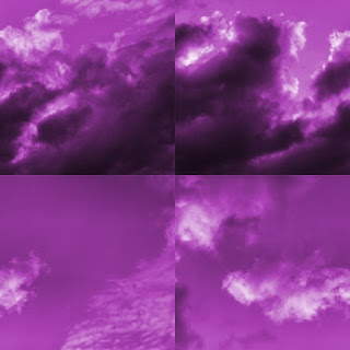
Okay so today we created textures by tiling, first I found this image on the internet and imported it into Photoshop. Now then by using the square select tool cut a square by keeping hold of the shift key you can make a even one. Then open a new document and paste the square in at a 512x512 size and resize the square to fit.
Stage 2 the actual tiling to do this I went to Filter >Other >Offset and then picked a tiling position I used 256x256 to get an even tile. To get rid of the lines were each tile meets, I used the clone stamp tool to make an usable texture.
To finish I put an over layer effect to change the colours and finally used brush effects to produce a lighten effect. The point of tiling is to keep the quality of an image without losing image quality.

Wednesday, 29 September 2010

Logo Mood Board

This is my first post from unit4 this unit involves me working as a team and therefore gain valuable teamwork experience. So as a team we had to create a mood board of logos to show how affective they were and use the techniques we learnt to create our own logos to advertise our company Intellectual Arcade.
Which include members;
Steve http://stupergrunt.blogspot.com/
Luke http://lukeg20.blogspot.com/
Jordan http://jordzdigitalworld.blogspot.com/
Marcus http://mvinter.blogspot.com/
And finally me
The first thing that stands out when looking at the mood board is the text "MAN MADE HELL" this isn't just because of the size of the text but also because of the bright yellow on a black background stands out. So if I were to have a black background I would also use bright colours such as orange, as if more people see your logo the more popular it will become. But why do you want your logo to be popular?, well being popular in the games industry means you are acknowledged as being good at what you do and this also means profit. A lot of the logos above don't have text like Mario, as bigger companies have already earned that popularity and therefore by just having an image of Mario we the intended audience know its representing Nintendo. But there are also a lot of logos above that don't have a image with there logo as an example of this would be "God Hand" as the logo for that game is intended to be simple and there are other ways to make your logo look unique without the use of an image like font, simple shapes and boarding.

The inspiration I have gotten from the mood board is when creating my logo the image will be simplistic and relevant to the company name. For example Apple the creators of the IPod and IPhone uses an apple for there logo, so therefore I will use a Arcade machine for mine.

Also some companies have more than one logo like the mood board shows a variety of EA logos used to give the company a fresh look and companies sometimes change there logo after time to show the company has changed or simply like Rockstar to represent a different part of the company, and therefore our team will create more than one logo to use for different things. For example one logo could be used for shirts and another for posters.

Sunday, 26 September 2010

Sky Boxes

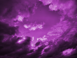
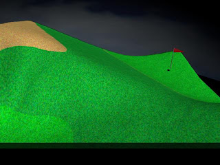
Okay so part 2 for creating my environment included sky boxes a process which allows me to render a background from the inside of a 3D shape by flipping the normals, so basically its like a one way mirror were the texture of a 3d shape can only be seen from the inside whereas it usually is seen from the outside so an environment can be placed inside that shape so the texture is perceived as the sky or background to an environment.
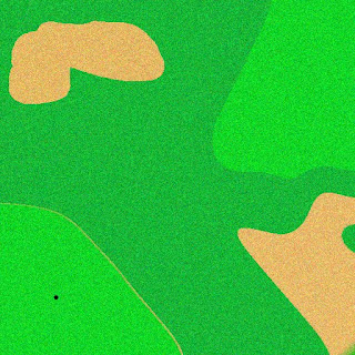
Well first I redid my texture for the environment to make it look more like a golf course. Again I achieved this by using various effects in Photoshop like the noise affect.
The shape I used for my sky box was a geo sphere, this was to allow the texture I used for my environment to look more like a sky as with a pointed shape like a cube gives the sky a very unnatural look.

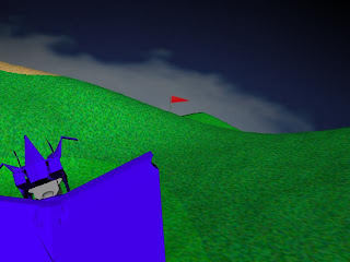
As you can properly see I also created a doodah, in this case being the flag. And I wanted a character, but I didn't have the time so I quickly created a slightly humanoid alien emperor with cape and slightly retarded but still official alien crown hat. I do plan on texturing him later on though.

Thursday, 16 September 2010

Making Environments

Okay well first I created a displacement map in Adobe Photoshop, We used white and black colours to represent peaks. And as usually I went crazy.
Then after opening 3Ds Max I created a few shapes and placed a modifier named Displace which allowed me to upload a texture to use, and I uploaded the one I created.
As you can see I put a background in and used bend modifiers on some shapes to create this weird creation.

But also as usual I also deiced to do it properly to demonstrate that I was listening.Unlike the last try, this time I placed the effect on a plain and used a noise affect in Photoshop to give the texture a grainy look. I was trying to make a golf course and will add a flag and hole later.


Monday, 21 June 2010

Unit 67 Completed...Yey!!

So unit 67 was a project where I was asked to create a storyboard in the form of a short comic strip that included at least one commercial cartoon character. And like usual I planned big so my original intentions where to create a 6 page graphic novel, even though the Unit only required me to create a 1 page comic strip. My character that I deiced to feature in my project would be Ulquiorra Cifer, a villain from the popular Japanese anime Bleach. I wanted something that no one else would pick and who didn't necessarily know the character so the first visual experience of that character would come from my comic strip and so I needed to capture the characters personalty, and to create an authentic comic I decided to base mine on a manga which basically is a Japanese style graphic novel which is read from right to left, I would adopt this style as the original graphic novel Bleach is a manga.

To the left is my original plans, I decided to create the manga beforehand on paper so I could, basically just scan it on to the computer, but because my plans were plans they were rough and I ended up creating everything by hand and only used my plans as a template.
This was the first time in my life that my plans look liked the finished product without any major alteration. The only things that changed was that I added a title page, and some things in the plan are more detailed on the computer, but that was to be expected.
When I had thought of a story I was unable to fit it onto 1 page so that's when I decided to go all out and spread the narrative over 6 pages. I figured that more is better, I tend to over do things...


My inspiration came from just a single image which I felt was humorous at the time, and above is that image along with my own which is completely redrawn, mine is the less professional looking one.

At the very beginning I was aiming for a older teenage audience, because the manga is in English I can only aim at an English reading audience and stereotypically this sort of content is liked by a male audience. So I didn't spare any expense and used some naughty swear words like Fuck and Bastards, but they were not there to offend anybody but there to create humour while introducing them to an informal conversation. The reason for an teenage audience was because the majority of Bleach's audience are teenagers and people who will read my manga will do so because the majority recognise the characters, the other character I'm using is Batman because Batman is almost iconography of the superhero world and therefore recognised not only by teenagers but at an international standard, so a wider audience is achieved by such a character.
The company I have decided to create this for would be Shonen Jump, a weekly anthology of manga publications which include Bleach, Naruto and One Piece.

I have stressed many times that I have an incapability of drawing, but I am rather good at tracing so a few characters are traces of already existing material. But because I had already visualised what I wanted, I had to edit the traced content to match my ideas.(See Below) Another problem that arose was the time it took me to create the 6 page manga, because I had to edit each character and create the scenery. But through determination it was completed on time more or less. I improved on a lot of existing techniques in Adobe Photoshop one of which was an outer glow effect to create the lighting of the background windows and lampposts. I also learnt how to use a Stroke effect on a box to create boarders for my panels of the manga. Bevel and Emboss was used frequently to give the scene a 3D look, for brickwork and other background objects. Speech bubbles where imported Photoshop brushes, as this gave me more variety than the default ones in auto shapes.

The drawing style was again Japanese themed, I used the Chibi style meaning small to give my characters a comedy element as well as cuteness as that's what Chibi is used for commonly.

But when I came to finally finish my manga I decided that it needed a title page so I used a completely original batman logo created from an oval liquidised in Photoshop.
I thought up the title at the end and thought is would be good to do it in Japanese again to give it an authentic manga look. 私がアメリカ人を憎むので「バットマン」は憎まれる, Wadashiga Amerikan-Jin O niku munode Batoman wa niku mareru, translated means, Because I hate Americans, batman is also hated. Even though it could be seen as anti American it doesn't matter because there too dumb too learn Japanese, but its all comedy.SO THere it is the final masterpiece just read it backwards, and it should make sense, if I were to do this again I will aim higher and do 12 pages just because I want to try my limits. I would try to brush up on my drawing skills to allow me to create a better and a completely original work. I would also need to manage time better as it took a lot of time to fully complete this project, but I believe with proper planning I can do it better.


Because I must compare my work to a professional piece I obviously decided to pick "Shōnen Jumps" Bleach, and there is a difference in profession standard, the overall drawing is in its own league because Tite Kubo the creator of Bleach is a very talented artist and I am not, plus the software used for a professional manga like this is a lot more practical than Adobe Photoshop. And mine is in colour but that's not a good thing because as a novel doesn't have coloured text, the reason for black and white manga apart from ink costs, is that people find it easier to read. and mine isn't that hard to read but it is only around 5 pages long. All in all I think there is a large difference between my work and the professionals, but if there weren't, it would show how bad the artists are these days.


See the full thing on this site as a cool flippy thing http://www.axmag.com/data/201006/bbcdfdfd-c201-42a1-8b8b-0f38ef799235/index.html

Thursday, 17 June 2010

Evaluation U64+U65

First lets start by saying that this unit was the hardest to accomplished but definitely very entertaining. My original idea was to create a star ship that was similar in looks to the Naboo Star Fighter from Star Wars. (see below to view my efforts)


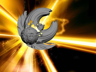
Even though I had created a perfectly good model for animating, I had already begun to create more 3D models from basic primitives. I felt I could do better so I tried to create something original rather than recycle used ideas.This was one of my first efforts on an original space ship, but I was really experimenting with bend modifiers which I used on the wings to give the space ship it's character. Once I had experimented I decided to use this knowledge to create a final model that I would use for the animation stage for this project. So my original intentions were constantly being changed and therefore are completely different from the my first idea.
This was the final model and below is the verifications I made to my model and how my model slowly but surely started to be something I was happy with. I insisted my ship would have a force field but I was unsure how it would look, I would achieve the force field by having a textured shape at low opacity to give the effect I wanted. The texture of the force field changed many times from textures found on the web to completely original ones made in Adobe Photoshop, to achieve the original concept that I was hoping for I decided to go with an original texture made with different varieties of Photoshop brushes.
I slowly began adding accessories to my models like guns, engines and internal dampeners
Then I went on creating a texture for the actual spaceship, I decided to use an inbuilt black gradient because of my complicated shape it was near impossible to texture using a UVW unwrap modifier.As you can see I have assigned a glass texture to faces using multi texturing, to create the window to the cockpit. To do this I had to set each face as a individual object and attach the texture using a material ID.
The final modifications to my spaceship where small, I created new guns and engines and changed the shape of the cockpit window to give the spaceship a more alien look.
Next I would have to create a environment for my space ship which I would also animate to add a more professional standard to my animation. I did experiment but quickly came up with a final idea, which was a hyperspace gate inspired by the Megagate from the American scifi show Stargate.
I created 3 rings to the hyperspace gate and animated each of the rings the move in the opposite directions to each other, I also created a centre to the gate using the same texture as my force field. For the effect I had a go at lens effects and trtied adding a glow effent to my spaceship, and twined with a bomb effect when the spaceship made contact with the bomb a flash of light appeared giving the effect of going through hyperspace. I finished the animation by having a camera follow my ship through the effects. (see below)


The problems with the finished animation was lighting, the effect I tried to gain with the glow backfired and distort the animation and after the space jump it becomes too dark too see the spaceship, and finally the spaceship is black so its hard to see it against the background. So I fixed these problems with my final render.

I fixed these problems by creating omni lights around my environment and I kept the bomb and got rid of all lens effects to keep the animation smooth and I changed the colour of the spaceship to a metallic purple so its easier to spot.


Comparing to a professional example of a 3D spaceship, I find that mine is better but to be honest I think that my spaceship is too simple as the profession example is more detailed which gives it a more realistic look, And the background makes the 3D model stand out while mine hides it. I do think that I've come a long way since my first days in 3Ds Max and believe in time I will be making 3D models just as good as that.


The target audience I'm trying to aim at, is the sci-fi fanatics basically because its a spaceship, the fans are usually male between the ages of 16 and 34. To appeal to my audience I used some originality with my spaceship and used the hyperspace gate to add some familiarity to the animation.

My weak points tend to be with the effects of 3D max, the modelling stage I think is my strongest point. If I were to do this unit again I would create a more detailed spaceship in parts and attach them later so I can spend time to detail each and every part of a spaceship, I would also use a brighter background to show off the model.