Monday, 8 November 2010

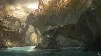
Another moodboard, Environment Visual

This is another one of my mood boards created using images from the Internet that inspire me for the creation of my 3D environment.

As my environment will be a rocky terrain I have got a lot of images that have rock formations and mountains, so I know what type of texture to use and to give ideas on different environment objects such as futuristic cities to small villages.

The star gate image will be used to inspire a similar construction for the transportation of a train from each of our teams environments.

The colours are mostly dark as my environment will have little light so I wanted images that would allow me to visualise a darker environment. There is also images of trees as I wish to add some vegetation, to show my skill.

Sunday, 7 November 2010

Drawing?? Its a plan (Unit 66/72)


Well let me explain, I had to pick as image from my visual mood board (still under construction) and use it as a template for my kind of retarded drawing skills. The image above is the image I picked and the one below is my finished sketch.
In detail - My finished drawing is different from the original as I didn't want to just copy it, I wanted to make it my own and so I decided to change it slightly, my first change was the water, I substituted water for sand and I only copied the first few rock formations and in the background I drew a little village and also Incorporated trees. I used two different types of pencils 2H which was used to draw the entire thing and for shading and outlining I used a darker 4B pencil. The shading was to allow my drawing too look more 3D, I did this by determining a light source and shading the darker areas. The 4B pencil was softer and therefore allowed my to extract darker tones. Compared to the original I believe it is similar but because the original was made using computer software it looks more realistic as the shading is clearly defined.This exercise was to improve our drawing skills and relearn all the lost information from high school art classes such as shading.
In detail - The reason for choosing this image was because I like concept images and I am inspiring to create my own 3D fantasy environment so I hope to create something similar in the future and another reason for changing aspects like the water is because I prefer to do this when the time comes to create my own.We were then instructed to split the finished drawing off into four sections to practise different types of colouring (See Above) Top Left - Felt Tip Pens, Top Right - Pastels, Bottom Left - Colour Pencil and Bottom Right was left blank.
Since I knew I was going to spoil my drawing anyways I decided to go crazy with colouring and planted what I had on paper hence the blue rock formation and yellow path. But I refuse to take all the blame as the felt tips and coloured pencils were of pound shop quality. Although I fell for the pastels they make anything look cool.
In detail - By using my drawing as a test I am able to see what medium I excel at, so that when the time comes I will use it to create my own concept art.

This image is the final product of my wacky colouring skills, and I am proud of what came,,, but I have to thank our teacher Mel-Sensei as she was able to salvage my image with a selection of fine detail and extra pastel smudging.
In detail - Pastels are good at defining 3D objects as you can smudge them to create shadows but you also have the option of easily incorporating more than one colour to give the image a more realistic look. The detail was done using a black fine liner as I needed to clearly show what objects were, for example the previously plain yellow path looks like a brick road because of the detail added.

Making rope

Well for my environment I wanted to create a few doodas and one that came to mind was a rope bridge, but the problem was the rope, but with the help of my friend Google, I found a tutorial to help me achieve my goal.
Step 1 - I would create a cylinder and use that as a template to create more smaller cylinders around the larger one, then after encircling the larger cylinder, I would then delete that cylinder, so all that was left are the smaller cylinder shapes.
Step 2 - I attached all the shapes and put a twist modifier on them and they looked like this (Below)


Step 3 - I went on to texture them by finding an online rope texture and to make it look a little more realistic I placed a bump texture on as well.
Step 4 - after finally texturing it, I realized it was too big and wide for a rope so I re sized it to fit its propose, and to finish I put a Bend modifier on the finished product. (See last image)Here is the final product I do think it is too neat for a rope bridge but that was because I used a circular cylinder instead of a edged cylinder like in the tutorial.
Just in case my ranting doesn't make sence this is the URL were the tutorial I used is. http://www.cgtextures.com/content.php?action=tutorial&name=rope

Thursday, 21 October 2010

Genre/Theme choices

The idea for what we wanted as a team where different from each other, but then I came up with a great idea, we would somehow use all our ideas and merge them into one trailer. Because Luke our modeler already had started work on a train, I was inspired by Back to the future III and the idea of using a train to jump through a variety of environments.
And borrowing the technology of Stargate, we will use something with similar design to transport our train.
The worlds we would have would include an American western, Futuristic Metropolis and a Fantasy World. the worlds would only have the train track and portal in common the rest would be completely original, because of this turn of events out game trailer will have a lot off genres the main one being a Fantasy.

I personally was inspired to do a fantasy world from the game franchise Final Fantasy. I wish to create an extremely complicated environment that is like maze as I wanted something that stands out.
The thunder plains environment from Final Fantasy X has some features I would want for my environment such as fog and the natural lighting rods. I will build these myself in max although I am worried how much time it will take to render if I choose to put in lighting as well as fog.


Thursday, 14 October 2010

Brain Storm for Team Name

Well I should have posted this first as it is the brainstorm for our team name. Our first lesson was to decide a name and we came up with a list and voted for them, to show we thought about it after our team created a brainstorm. (Below)Our brainstorm wasn't used just for our name but also how we would present that name in a logo. We discussed shape, font and colour and gave bad points and good points on using different things, for example the colour yellow would make our name stand out but makes it harder to read.
By creating this brainstorm and the previous mood board we were able to come up with a template which was used in my previous post to create experimental logos.
The template was as follows;
  1. Colour - Monochrome, Green and Red
  2. Font - Italic, Bold and Sharp
  3. Shapes - Arcade, Brain and Squares
  1. The reason for using monochrome was simple but affective visually, and using green and red was to add colours that represent the sci-fi genre which our team was basing our trailer on.
  2. The reason for using Italic was to make our logo look posh to suit our name and bold and sharp to keep with the word "Arcade"
  3. Using shapes that allow us to create objects that also suit our name, using squares gives the logo a pixely retro look.

Logo concepts

Hello people, today our team created some logos and I had an image of what I wanted so I ended up creating quite a few to experiment. By using our previous logo mood board as an example and inspiration I came up with the idea of using an arcade machine or a brain to make the logo relevant to our name.
The logo above was the first I created the brain is a Photoshop brush I came up with the idea of having different fonts for each word which I want to keep in the final design.

I decided to create another image to represent the team, this time I tried to incorporate both words "Intellectual" and "Arcade", unlike my first idea which didn't have anything to represent the word "Arcade".

This is another concept design which is a simpler design because I found the latter to be too complicated and this one is completely original with no terminator arms.
The Above is my final creations all I did was combine the font of my first logo design and the image from my other, I also inverted it to allow the design to work on both white and black backgrounds.

Sunday, 10 October 2010

Building Interiors

So today I learnt how to create building interiors, first I used a simple 3D rectangle and turned it into an editable mesh. I then began extrude inside to create rooms, Oh and to see what I was doing I cut the top of my rectangle by deleting the poly's.
I wanted to create a more complex structure to test my skills, so I decided to create two floors but I found that creating stairs was harder than I thought. To overcome that problem I duplicated the shape to get the right measurements and decided to create two floors separately the stairs were a lot easier when you have something to compare against.


This is a render of how I progressed, but I forgot to flip the normals so you can see through it.