Thursday, 14 October 2010

Brain Storm for Team Name

Well I should have posted this first as it is the brainstorm for our team name. Our first lesson was to decide a name and we came up with a list and voted for them, to show we thought about it after our team created a brainstorm. (Below)Our brainstorm wasn't used just for our name but also how we would present that name in a logo. We discussed shape, font and colour and gave bad points and good points on using different things, for example the colour yellow would make our name stand out but makes it harder to read.
By creating this brainstorm and the previous mood board we were able to come up with a template which was used in my previous post to create experimental logos.
The template was as follows;
  1. Colour - Monochrome, Green and Red
  2. Font - Italic, Bold and Sharp
  3. Shapes - Arcade, Brain and Squares
  1. The reason for using monochrome was simple but affective visually, and using green and red was to add colours that represent the sci-fi genre which our team was basing our trailer on.
  2. The reason for using Italic was to make our logo look posh to suit our name and bold and sharp to keep with the word "Arcade"
  3. Using shapes that allow us to create objects that also suit our name, using squares gives the logo a pixely retro look.

Logo concepts

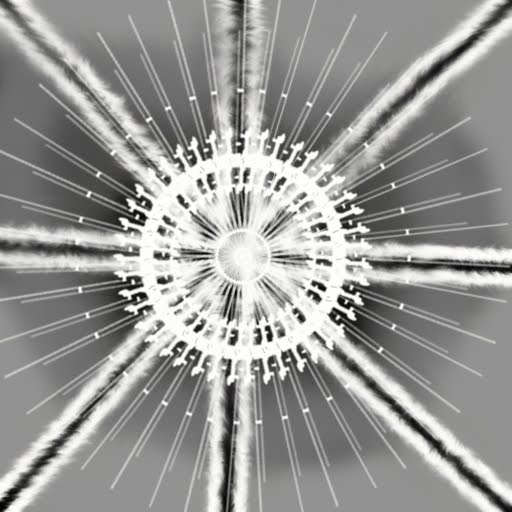
Hello people, today our team created some logos and I had an image of what I wanted so I ended up creating quite a few to experiment. By using our previous logo mood board as an example and inspiration I came up with the idea of using an arcade machine or a brain to make the logo relevant to our name.
The logo above was the first I created the brain is a Photoshop brush I came up with the idea of having different fonts for each word which I want to keep in the final design.

I decided to create another image to represent the team, this time I tried to incorporate both words "Intellectual" and "Arcade", unlike my first idea which didn't have anything to represent the word "Arcade".

This is another concept design which is a simpler design because I found the latter to be too complicated and this one is completely original with no terminator arms.
The Above is my final creations all I did was combine the font of my first logo design and the image from my other, I also inverted it to allow the design to work on both white and black backgrounds.

Sunday, 10 October 2010

Building Interiors

So today I learnt how to create building interiors, first I used a simple 3D rectangle and turned it into an editable mesh. I then began extrude inside to create rooms, Oh and to see what I was doing I cut the top of my rectangle by deleting the poly's.
I wanted to create a more complex structure to test my skills, so I decided to create two floors but I found that creating stairs was harder than I thought. To overcome that problem I duplicated the shape to get the right measurements and decided to create two floors separately the stairs were a lot easier when you have something to compare against.


This is a render of how I progressed, but I forgot to flip the normals so you can see through it.

Thursday, 30 September 2010

Tiling, for texturing


Okay so today we created textures by tiling, first I found this image on the internet and imported it into Photoshop. Now then by using the square select tool cut a square by keeping hold of the shift key you can make a even one. Then open a new document and paste the square in at a 512x512 size and resize the square to fit.
Stage 2 the actual tiling to do this I went to Filter >Other >Offset and then picked a tiling position I used 256x256 to get an even tile. To get rid of the lines were each tile meets, I used the clone stamp tool to make an usable texture.
To finish I put an over layer effect to change the colours and finally used brush effects to produce a lighten effect. The point of tiling is to keep the quality of an image without losing image quality.

Wednesday, 29 September 2010

Logo Mood Board

This is my first post from unit4 this unit involves me working as a team and therefore gain valuable teamwork experience. So as a team we had to create a mood board of logos to show how affective they were and use the techniques we learnt to create our own logos to advertise our company Intellectual Arcade.
Which include members;
Steve http://stupergrunt.blogspot.com/
Luke http://lukeg20.blogspot.com/
Jordan http://jordzdigitalworld.blogspot.com/
Marcus http://mvinter.blogspot.com/
And finally me
The first thing that stands out when looking at the mood board is the text "MAN MADE HELL" this isn't just because of the size of the text but also because of the bright yellow on a black background stands out. So if I were to have a black background I would also use bright colours such as orange, as if more people see your logo the more popular it will become. But why do you want your logo to be popular?, well being popular in the games industry means you are acknowledged as being good at what you do and this also means profit. A lot of the logos above don't have text like Mario, as bigger companies have already earned that popularity and therefore by just having an image of Mario we the intended audience know its representing Nintendo. But there are also a lot of logos above that don't have a image with there logo as an example of this would be "God Hand" as the logo for that game is intended to be simple and there are other ways to make your logo look unique without the use of an image like font, simple shapes and boarding.

The inspiration I have gotten from the mood board is when creating my logo the image will be simplistic and relevant to the company name. For example Apple the creators of the IPod and IPhone uses an apple for there logo, so therefore I will use a Arcade machine for mine.

Also some companies have more than one logo like the mood board shows a variety of EA logos used to give the company a fresh look and companies sometimes change there logo after time to show the company has changed or simply like Rockstar to represent a different part of the company, and therefore our team will create more than one logo to use for different things. For example one logo could be used for shirts and another for posters.

Sunday, 26 September 2010

Sky Boxes

Okay so part 2 for creating my environment included sky boxes a process which allows me to render a background from the inside of a 3D shape by flipping the normals, so basically its like a one way mirror were the texture of a 3d shape can only be seen from the inside whereas it usually is seen from the outside so an environment can be placed inside that shape so the texture is perceived as the sky or background to an environment.
Well first I redid my texture for the environment to make it look more like a golf course. Again I achieved this by using various effects in Photoshop like the noise affect.
The shape I used for my sky box was a geo sphere, this was to allow the texture I used for my environment to look more like a sky as with a pointed shape like a cube gives the sky a very unnatural look.

As you can properly see I also created a doodah, in this case being the flag. And I wanted a character, but I didn't have the time so I quickly created a slightly humanoid alien emperor with cape and slightly retarded but still official alien crown hat. I do plan on texturing him later on though.

Thursday, 16 September 2010

Making Environments

Okay well first I created a displacement map in Adobe Photoshop, We used white and black colours to represent peaks. And as usually I went crazy.
Then after opening 3Ds Max I created a few shapes and placed a modifier named Displace which allowed me to upload a texture to use, and I uploaded the one I created.
As you can see I put a background in and used bend modifiers on some shapes to create this weird creation.

But also as usual I also deiced to do it properly to demonstrate that I was listening.Unlike the last try, this time I placed the effect on a plain and used a noise affect in Photoshop to give the texture a grainy look. I was trying to make a golf course and will add a flag and hole later.