So unit 67 was a project where I was asked to create a storyboard in the form of a short comic strip that included at least one commercial cartoon character. And like usual I planned big so my original intentions where to create a 6 page graphic novel, even though the Unit only required me to create a 1 page comic strip. My character that I deiced to feature in my project would be Ulquiorra Cifer, a villain from the popular Japanese anime Bleach. I wanted something that no one else would pick and who didn't necessarily know the character so the first visual experience of that character would come from my comic strip and so I needed to capture the characters personalty, and to create an authentic comic I decided to base mine on a manga which basically is a Japanese style graphic novel which is read from right to left, I would adopt this style as the original graphic novel Bleach is a manga.
 To the left is my original plans, I decided to create the manga beforehand on paper so I could, basically just scan it on to the computer, but because my plans were plans they were rough and I ended up creating everything by hand and only used my plans as a template.
This was the first time in my life that my plans look liked the finished product without any major alteration. The only things that changed was that I added a title page, and some things in the plan are more detailed on the computer, but that was to be expected.
When I had thought of a story I was unable to fit it onto 1 page so that's when I decided to go all out and spread the narrative over 6 pages. I figured that more is better, I tend to over do things...
 My inspiration came from just a single image which I felt was humorous at the time, and above is that image along with my own which is completely redrawn, mine is the less professional looking one.
 I thought up the title at the end and thought is would be good to do it in Japanese again to give it an authentic manga look.
 SO THere it is the final masterpiece just read it backwards, and it should make sense, if I were to do this again I will aim higher and do 12 pages just because I want to try my limits. I would try to brush up on my drawing skills to allow me to create a better and a completely original work. I would also need to manage time better as it took a lot of time to fully complete this project, but I believe with proper planning I can do it better.
 Because I must compare my work to a professional piece I obviously decided to pick "Shōnen Jumps" Bleach, and there is a difference in profession standard, the overall drawing is in its own league because Tite Kubo the creator of Bleach is a very talented artist and I am not, plus the software used for a professional manga like this is a lot more practical than Adobe Photoshop. And mine is in colour but that's not a good thing because as a novel doesn't have coloured text, the reason for black and white manga apart from ink costs, is that people find it easier to read. and mine isn't that hard to read but it is only around 5 pages long. All in all I think there is a large difference between my work and the professionals, but if there weren't, it would show how bad the artists are these days.
When I had thought of a story I was unable to fit it onto 1 page so that's when I decided to go all out and spread the narrative over 6 pages. I figured that more is better, I tend to over do things...
 My inspiration came from just a single image which I felt was humorous at the time, and above is that image along with my own which is completely redrawn, mine is the less professional looking one.
At the very beginning I was aiming for a older teenage audience, because the manga is in English I can only aim at an English reading audience and stereotypically this sort of content is liked by a male audience. So I didn't spare any expense and used some naughty swear words like Fuck and Bastards, but they were not there to offend anybody but there to create humour while introducing them to an informal conversation. The reason for an teenage audience was because the majority of Bleach's audience are teenagers and people who will read my manga will do so because the majority recognise the characters, the other character I'm using is Batman because Batman is almost iconography of the superhero world and therefore recognised not only by teenagers but at an international standard, so a wider audience is achieved by such a character.
The company I have decided to create this for would be Shonen Jump, a weekly anthology of manga publications which include Bleach, Naruto and One Piece.
I have stressed many times that I have an incapability of drawing, but I am rather good at tracing so a few characters are traces of already existing material. But because I had already visualised what I wanted, I had to edit the traced content to match my ideas.(See Below) Another problem that arose was the time it took me to create the 6 page manga, because I had to edit each character and create the scenery. But through determination it was completed on time more or less. I improved on a lot of existing techniques in Adobe Photoshop one of which was an outer glow effect to create the lighting of the background windows and lampposts. I also learnt how to use a Stroke effect on a box to create boarders for my panels of the manga. Bevel and Emboss was used frequently to give the scene a 3D look, for brickwork and other background objects. Speech bubbles where imported Photoshop brushes, as this gave me more variety than the default ones in auto shapes.
The drawing style was again Japanese themed, I used the Chibi style meaning small to give my characters a comedy element as well as cuteness as that's what Chibi is used for commonly.
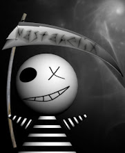
But when I came to finally finish my manga I decided that it needed a title page so I used a completely original batman logo created from an oval liquidised in Photoshop.
The company I have decided to create this for would be Shonen Jump, a weekly anthology of manga publications which include Bleach, Naruto and One Piece.
I have stressed many times that I have an incapability of drawing, but I am rather good at tracing so a few characters are traces of already existing material. But because I had already visualised what I wanted, I had to edit the traced content to match my ideas.(See Below)
 Another problem that arose was the time it took me to create the 6 page manga, because I had to edit each character and create the scenery. But through determination it was completed on time more or less. I improved on a lot of existing techniques in Adobe Photoshop one of which was an outer glow effect to create the lighting of the background windows and lampposts. I also learnt how to use a Stroke effect on a box to create boarders for my panels of the manga. Bevel and Emboss was used frequently to give the scene a 3D look, for brickwork and other background objects. Speech bubbles where imported Photoshop brushes, as this gave me more variety than the default ones in auto shapes.
The drawing style was again Japanese themed, I used the Chibi style meaning small to give my characters a comedy element as well as cuteness as that's what Chibi is used for commonly.
But when I came to finally finish my manga I decided that it needed a title page so I used a completely original batman logo created from an oval liquidised in Photoshop.
 I thought up the title at the end and thought is would be good to do it in Japanese again to give it an authentic manga look.
 SO THere it is the final masterpiece just read it backwards, and it should make sense, if I were to do this again I will aim higher and do 12 pages just because I want to try my limits. I would try to brush up on my drawing skills to allow me to create a better and a completely original work. I would also need to manage time better as it took a lot of time to fully complete this project, but I believe with proper planning I can do it better.
 Because I must compare my work to a professional piece I obviously decided to pick "Shōnen Jumps" Bleach, and there is a difference in profession standard, the overall drawing is in its own league because Tite Kubo the creator of Bleach is a very talented artist and I am not, plus the software used for a professional manga like this is a lot more practical than Adobe Photoshop. And mine is in colour but that's not a good thing because as a novel doesn't have coloured text, the reason for black and white manga apart from ink costs, is that people find it easier to read. and mine isn't that hard to read but it is only around 5 pages long. All in all I think there is a large difference between my work and the professionals, but if there weren't, it would show how bad the artists are these days.
See the full thing on this site as a cool flippy thing http://www.axmag.com/data/201006/bbcdfdfd-c201-42a1-8b8b-0f38ef799235/index.html