--The Reflection--
[sorry but I'm engaging into work mode--Bare with me]
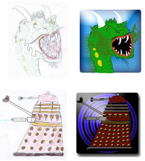
When I first started to design my concept images I was optimistic and put a lot of detail into my designs, it was only after I had shrunk my finished designs down to 5x5cm that I realised that my detail was in vain as it made the icon unrecognisable when small. It was then that I rushed to create simple designs, as a result my icons look a bit unprofessional, but I was proud nevertheless. At that point I had already decided which image I would use to create my icon, although it wasn't part of my original plan. The image or avatar I use in the digital world 'dubbed' Helix would become my icon the image is an original one that I created from his 2D version using the graphics creation software 3Ds Max. Even though I had first planned to use a digital reincarnated version of one of my concept drawings, I was happy in the end with my descion. Below are some of my orginal drawings and finshed icons.
^^^^^^^^^^^^^^^^^^^^^^^^^^^^^^^^^^^
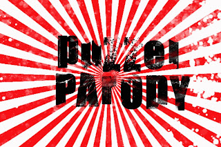
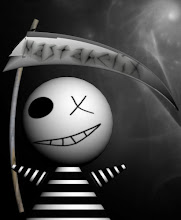
The game that my icon will be representing is a puzzle game named 'Puzzle Parody', it will include aspects that are recognised by my audience, the audience I am aiming for is the population that enjoy Japanese anime also known to the nation of Japan as "Otaku". The Icon it's self I believe will appeal to my audience, however I believe with such a multipurpose image that it may attract others as well. My intented audience is ranged from gender and age, but I believe my icon leans towards a teenage male audience, my original concept images where characters from popular anime series, but because of my earlier concerns I was unable to create them, another factor would be because the characters weren't original, but they did help influence me into using my own character 'So to speak' to add originality.
Below is my games meun or title screen created in Photoshop.
^^^^^^^^^^^^^^^^^^^^^^^^^^^^^^^^^^^
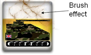
To create my icons I used only a few programmes one being Adobe Photoshop and 3Ds Max to create my final icon. I would say my skills with Photoshop are good because of the immense experience from college and high school, but because 3Ds Max is a lot more complicated and I am fairly new to the software I have yet to master the software. In Photoshop I used inbuilt styles to create the icon backgrounds and uploaded new ones via the web to create the rest. I did use a drawing tablet and scanned images at first for two of my icons, but then I proceeded to create the rest by hand to make them simple. I found the drawing tablet to make life easier when drawing more detailed designs, but for the less complicated ones, I prefer to it by hand, only because of the time consumption. When drawing the concept images i used normal pencils and colouring pencils, this was not because there was nothing available in fact there was but it was because i felt more comfortable drawing that way. The only effects I used were Bevel and Emboss to make aspects of my icons look 3D, thus adding professionalism. My final icon was easier to create because of the installed standard primitives, this allowed me to easily create a sphere, the details were then created in Photoshop and then I used that as a texture for the sphere. Photoshop does have a lot of brushes to choose from and I took advantage of this to make my icons look smooth and beat the pixelised look when using a square brush. Some of the brush's I used included 'DarkWing' this allowed me to give my dragon a more authentic look by using the wings as ears. Another was 'Smoke' this allowed me to give my tank the effect that it was in a desert by using the smoke as a sandstorm. (see below)
^^^^^^^^^^^^^^^^^^^^^^^^^^^^^^^^^^^^^^^
The research I did before starting this project helped because I wouldn't have known about the size and therefore wouldn't have addressed or even noticed the problem. This would have resulted in me not meeting the deadline, but because I did realise and recreated my icons I met all deadlines and had no problem with time management. I did learn a lot about Photoshop within this project, for example I didn't know you could download themes for Photoshop and I found new ways to use brushes. I haven't as much learnt more skills but improved on them. And finally if I were to do this again I would push myself to create better icons, but overall I am happy with my icons as they are, but like I said there is always room for improvement. The response from my peers was good and
I had positive comments and responses from everyone.
By the way to enlighten the mood from my boring psycho babble here's a kitten...


 To do this you have to put a modifier on a model, called Unwrap UVW. And then just import the unwrapped model into Photoshop, and through a few effects like overlaying just simply decorate the texture and re-import the finished design as a bitmap texture..
 To do this you have to put a modifier on a model, called Unwrap UVW. And then just import the unwrapped model into Photoshop, and through a few effects like overlaying just simply decorate the texture and re-import the finished design as a bitmap texture..


