
Part 2 of my project was the creation of the icons digitally, i did this by scanning my hand drawn images into Photoshop and using a drawing tablet to trace them.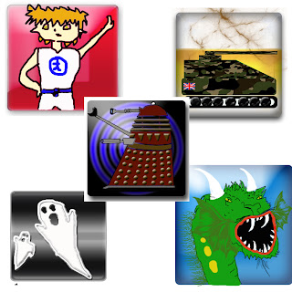 Now they don't look like much, but because the icons will be displayed on a IPhone menu, i had to create simple designs that would look good when minimised. Hence the loss of detail. I am espically pround of the darlik because of it's detail but like i said you won't really notice it when it's 72 pixels wide.
 Now they don't look like much, but because the icons will be displayed on a IPhone menu, i had to create simple designs that would look good when minimised. Hence the loss of detail. I am espically pround of the darlik because of it's detail but like i said you won't really notice it when it's 72 pixels wide.


No comments:
Post a Comment